National Cooperative Data Analytics Dashboard — Kemenkop UKM RI

Year 2023 Client Edi S. Category UI/UX Design Timeline 2 Weeks The Challenge The Ministry of Cooperatives and SMEs of Indonesia faced a significant bottleneck in data accessibility. Years of critical cooperative data—ranging from capital growth to regional distribution—were locked in hundreds of pages of static PDF reports. The challenge was twofold: consolidating massive “Big […]
Web Koperasi-2
Year
2023
Client
Edi S.
Category
UI/UX Design
Timeline
2 Weeks
The Challenge

The Ministry of Cooperatives and SMEs of Indonesia faced a significant bottleneck in data accessibility. Years of critical cooperative data—ranging from capital growth to regional distribution—were locked in hundreds of pages of static PDF reports. The challenge was twofold: consolidating massive “Big Data” into a single source of truth and designing an interface inclusive enough for internal ministry staff, many of whom are senior officials requiring high legibility and intuitive navigation.

The Approach

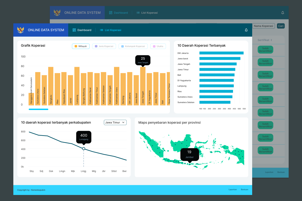
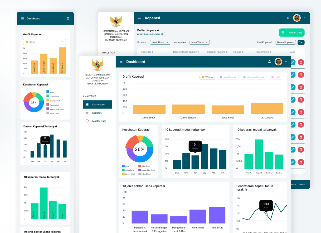
As a solo designer commissioned by a Jakarta-based agency, I executed a 2-week rapid design sprint with daily reporting. My focus was on Data Democratization. I conducted deep analysis to simplify complex data sets into visual hierarchies that prioritize “The Big Picture” without losing granular details. I focused on high-contrast visuals, clear typography, and simplified navigation to ensure the platform remains accessible to users of all ages and technical backgrounds.

The Solution

I architected a comprehensive dashboard that transformed raw data into actionable insights:

  1. Geospatial Mapping: An interactive map showing the density and distribution of cooperatives across all provinces in Indonesia.
  2. Performance Analytics: Clean, high-legibility charts and tables that allow users to instantly identify cooperatives with the highest capital and regional potential.
  3. Digital Transformation: Replaced cumbersome manual PDF reporting with a dynamic digital system, featuring advanced filtering and timeline-based tracking for SME data accuracy.
Web Koperasi-1
UI UX Koperasi Dashboard
The Impact

The transition to this digital dashboard fundamentally changed how the Ministry interacts with national data:

  1. Total Transparency: Cooperative data became instantly accessible and transparent across departments.
  2. 80% Faster Data Retrieval: What previously took hours of searching through PDFs can now be found in seconds through optimized search and filter functions.
  3. Enhanced Inclusivity: The user-friendly interface successfully bridged the digital divide, allowing staff of all ages to monitor national cooperative performance with zero friction and high confidence.

Related work