2022
Telkomcell
UI/UX Design
2 Weeks
The Challenge
Telkomcell required a robust internal dashboard to monitor their prepaid credit circulation and track crucial daily activities. The main hurdle wasn’t establishing a visual language—as Telkomcell already possessed a highly established brand identity—but rather structuring a massive amount of raw data into an easily digestible format for internal employees. Additionally, navigating this project during the COVID-19 pandemic meant all coordination and user interviews had to be executed remotely via Zoom.
The Approach
Because the brand guidelines and team requirements were exceptionally clear, I was able to execute a rapid two-week design sprint. I redirected the time typically spent on visual exploration entirely into information architecture and data hierarchy. Through targeted remote interviews, I identified exactly what metrics employees needed to see first, stripping away unnecessary elements that usually clutter enterprise software.
The Solution
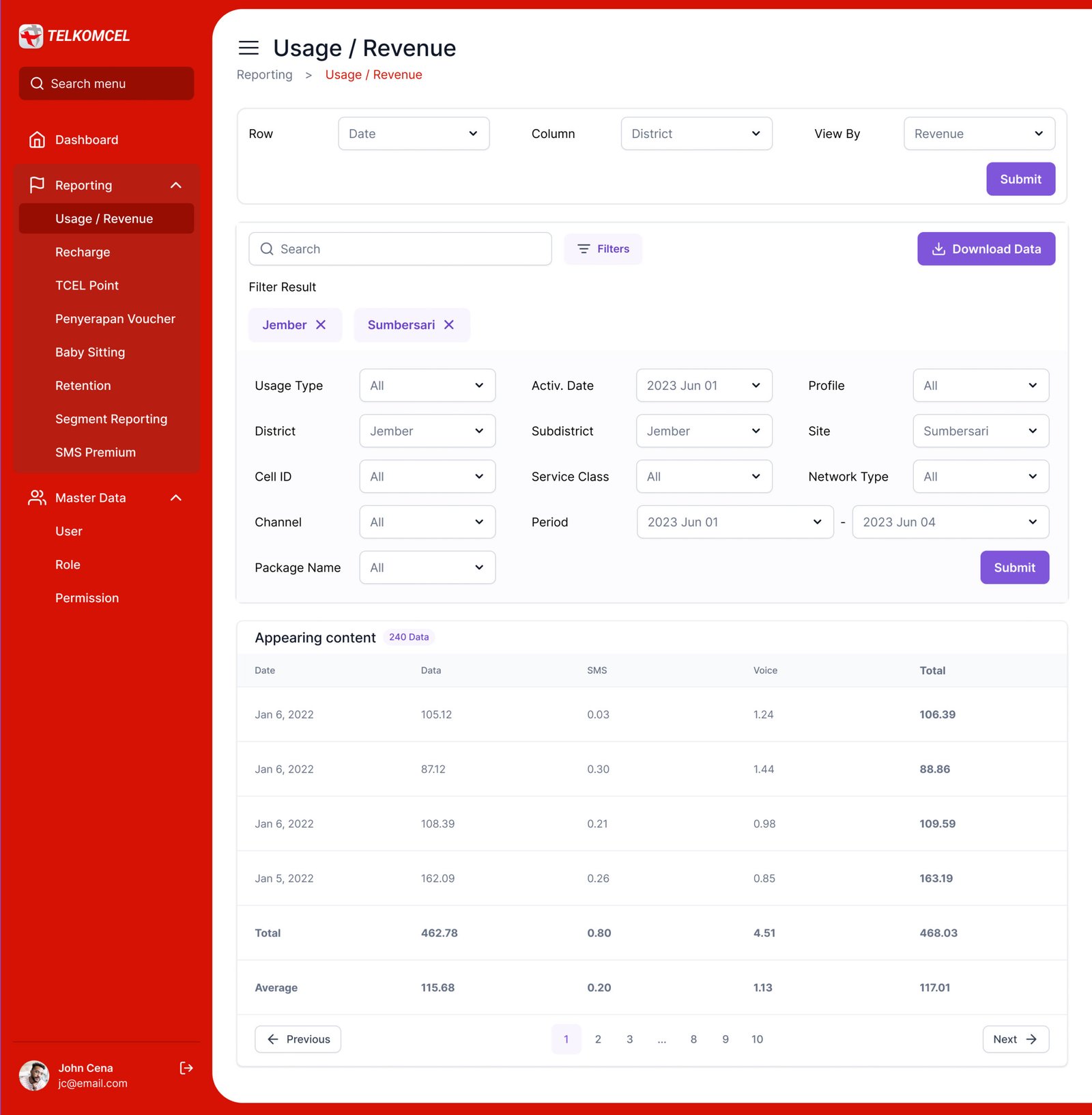
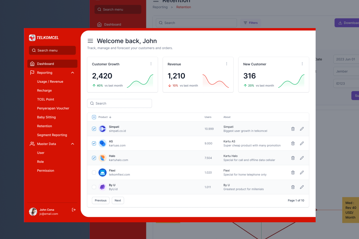
I architected a dashboard focused heavily on clear navigation and logical data grouping. By arranging the interface to mirror the actual workflow of the employees, the dashboard presents critical activities and features upfront. The design ensures that complex prepaid credit data is highly legible, structured, and easy to interact with, minimizing cognitive fatigue.
The Impact
The launch of the dashboard brought immediate, measurable improvements to Telkomcell’s internal operations:
80% Reduction in Reporting Errors: The streamlined layout and clear data visibility drastically minimized oversight and missed data reporting.
2x Faster Data Processing: Employees can now scan reports and read critical data twice as fast, thanks to the intuitive navigation and tailored data arrangement.
Enhanced Traceability & Usability: The overall circulation of prepaid credit data became highly traceable, empowering employees to monitor product performance with absolute confidence and minimal friction.